Branding / Identity
Logo Design
Web Design
Design for Print
Product Design
UI Design
Accessplc, a specialist in IT recruitment and professional services, approached me with a clear challenge: to build a new website from the ground up that could balance their people-focused values with the forward-thinking mindset of the tech industry. Unlike their sister company, Access IT Automation, Accessplc puts people at the centre—acting as the connection point between ambitious talent and the companies driving digital innovation.
My task was to rebrand, redesign, and rebuild their entire digital presence—creating a sleek, modern platform that felt both deeply human and technologically sharp.
The Challenge
Accessplc’s existing website no longer reflected the company’s evolving identity. It lacked the intuitive structure, professional polish, and engaging experience that today’s candidates and clients expect.
They needed a digital home that would:
Reflect their unique position at the intersection of people and tech
Present a modern, professional look that aligned with industry standards
Serve both job seekers and enterprise clients equally well
Be fully responsive and accessible
I saw this not just as a web design task, but a full brand refresh—grounded in research, strategy, and user-centered thinking.
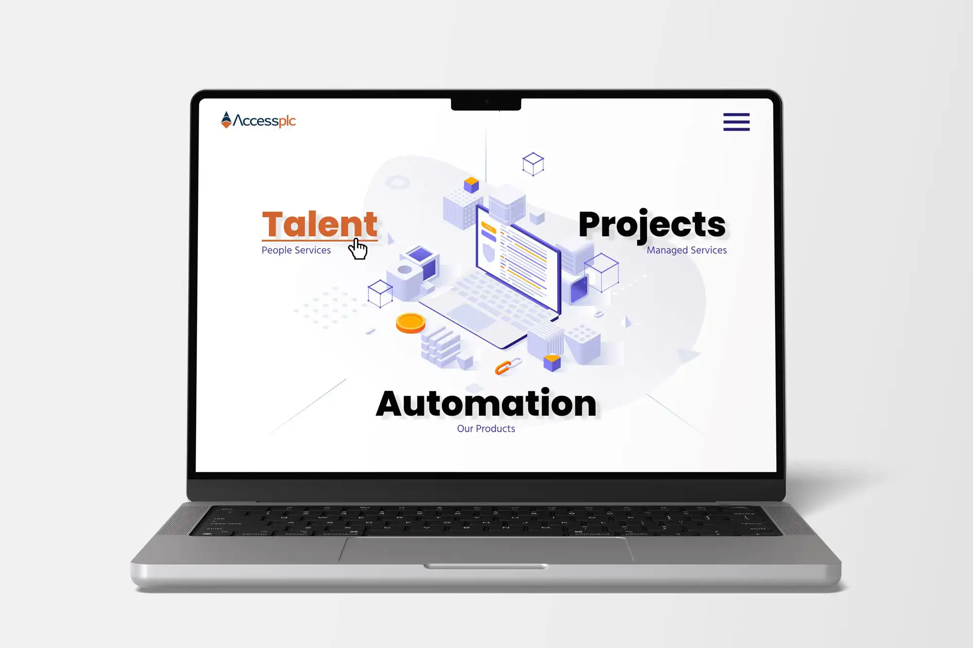
I began with stakeholder interviews, competitor analysis, and UX research to understand how Accessplc differentiates itself. The insight was clear: while many recruitment firms lean too far into corporate jargon or bland design, Accessplc had the potential to speak with clarity and warmth while still looking sharp.
I refined the brand’s tone of voice and introduced a new visual identity that included:
A refreshed logo symbolizing the tech-human balance
A professional yet inviting colour palette (Innovative Coral, Tech Navy, Cloud Whisper, White)
New typography and graphic accents that balanced structure with flow
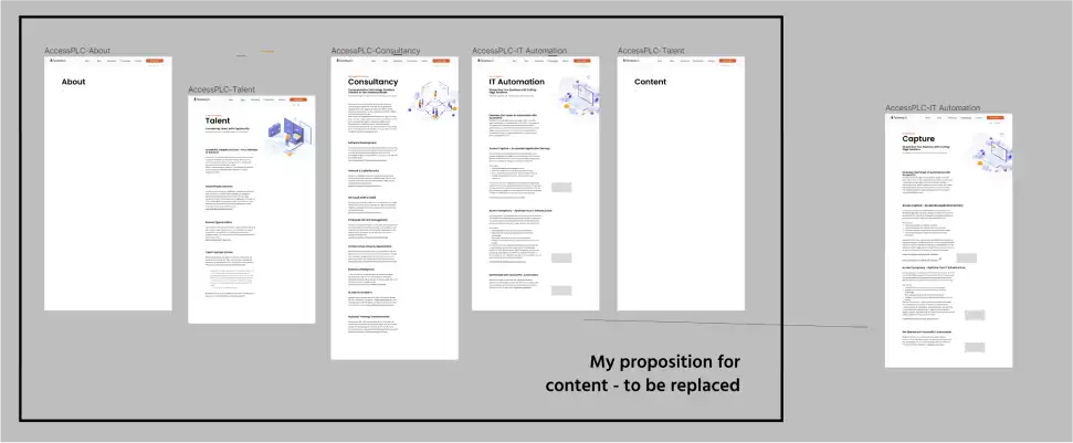
I mapped out user journeys for clients, candidates, and internal stakeholders, ensuring intuitive navigation, clear CTAs, and a focus on usability.
Interactive wireframes and high-fidelity prototypes were created and tested to validate:
User flows for job applications and contact
Key information hierarchy
Content accessibility across devices
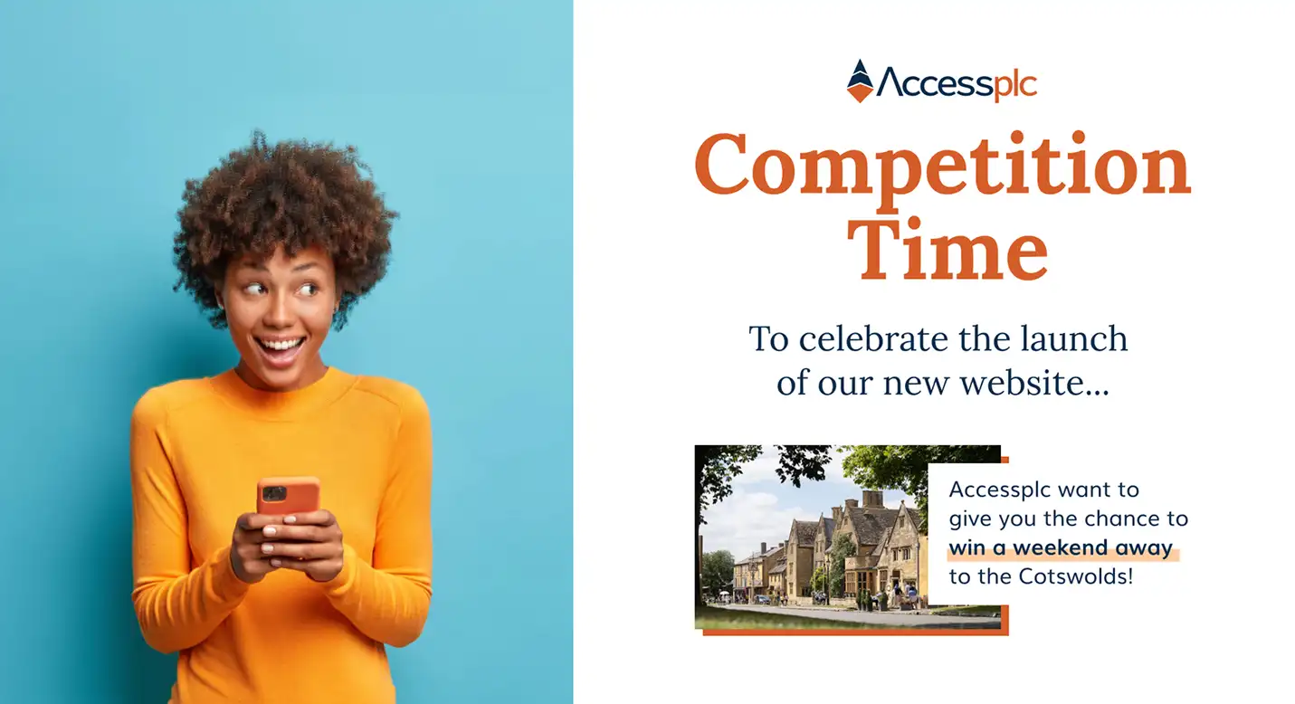
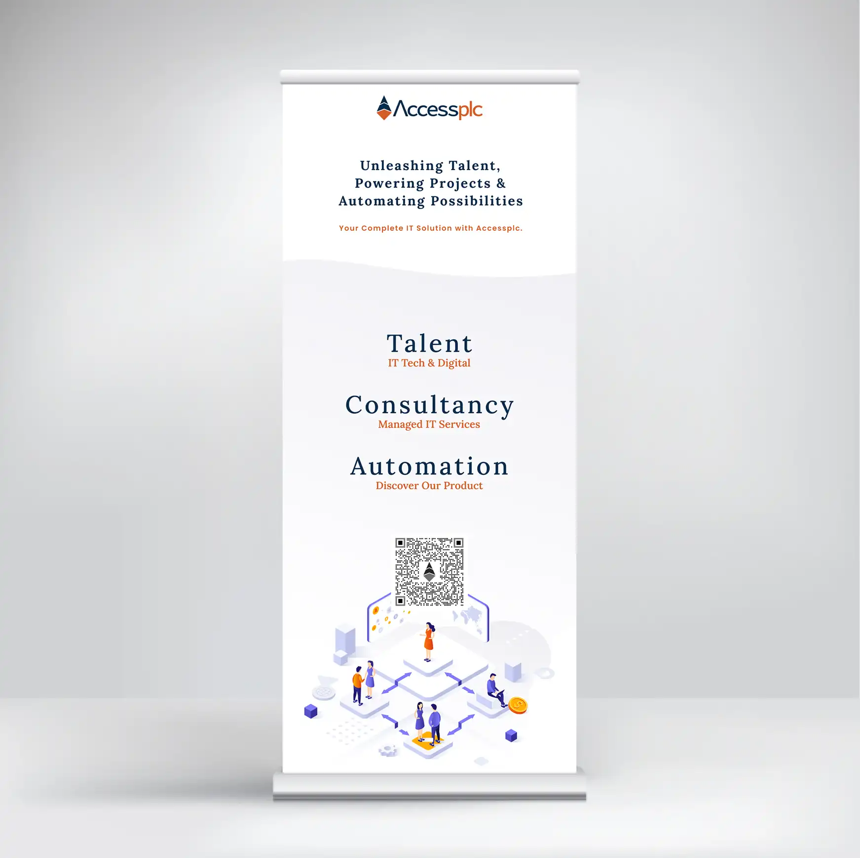
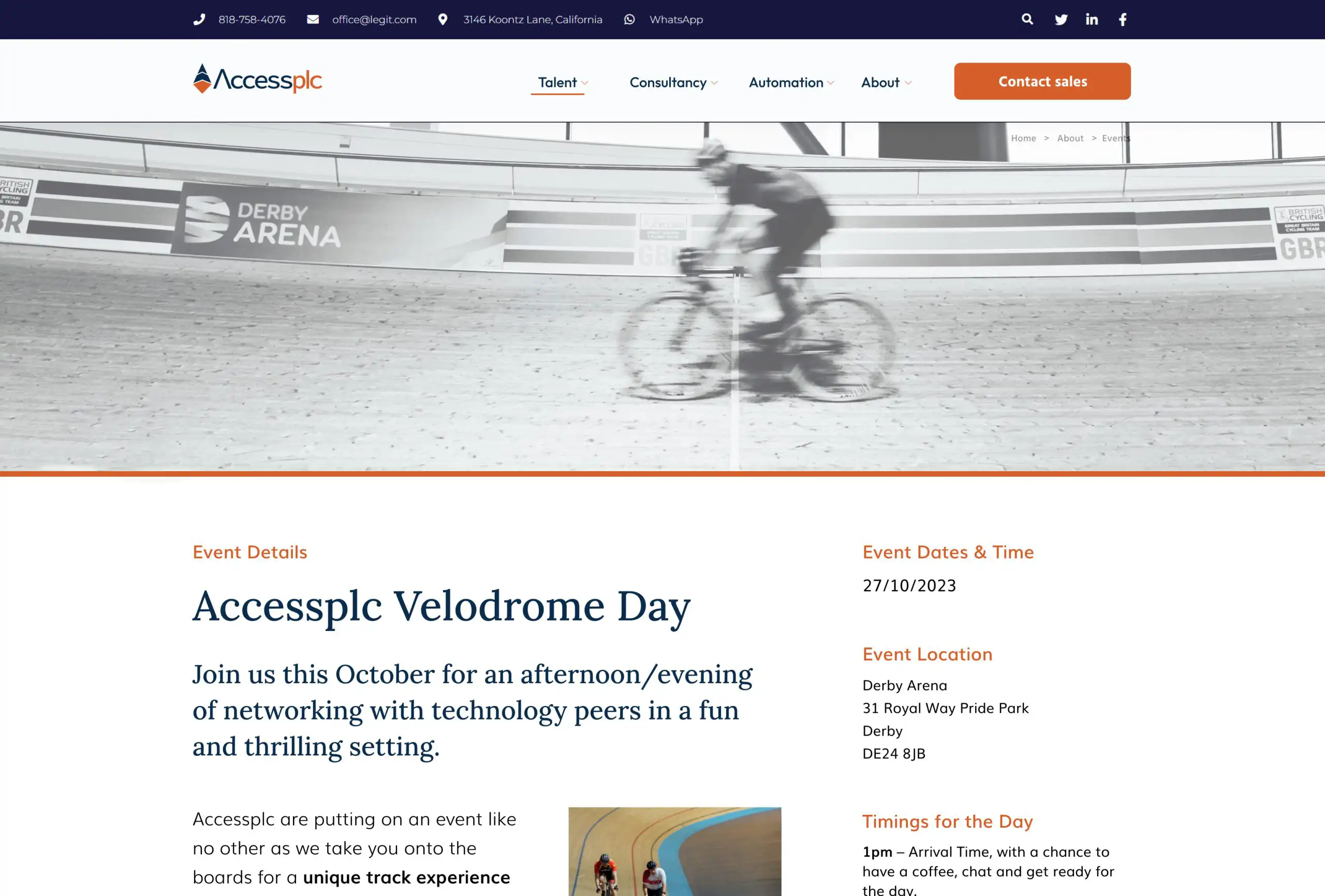
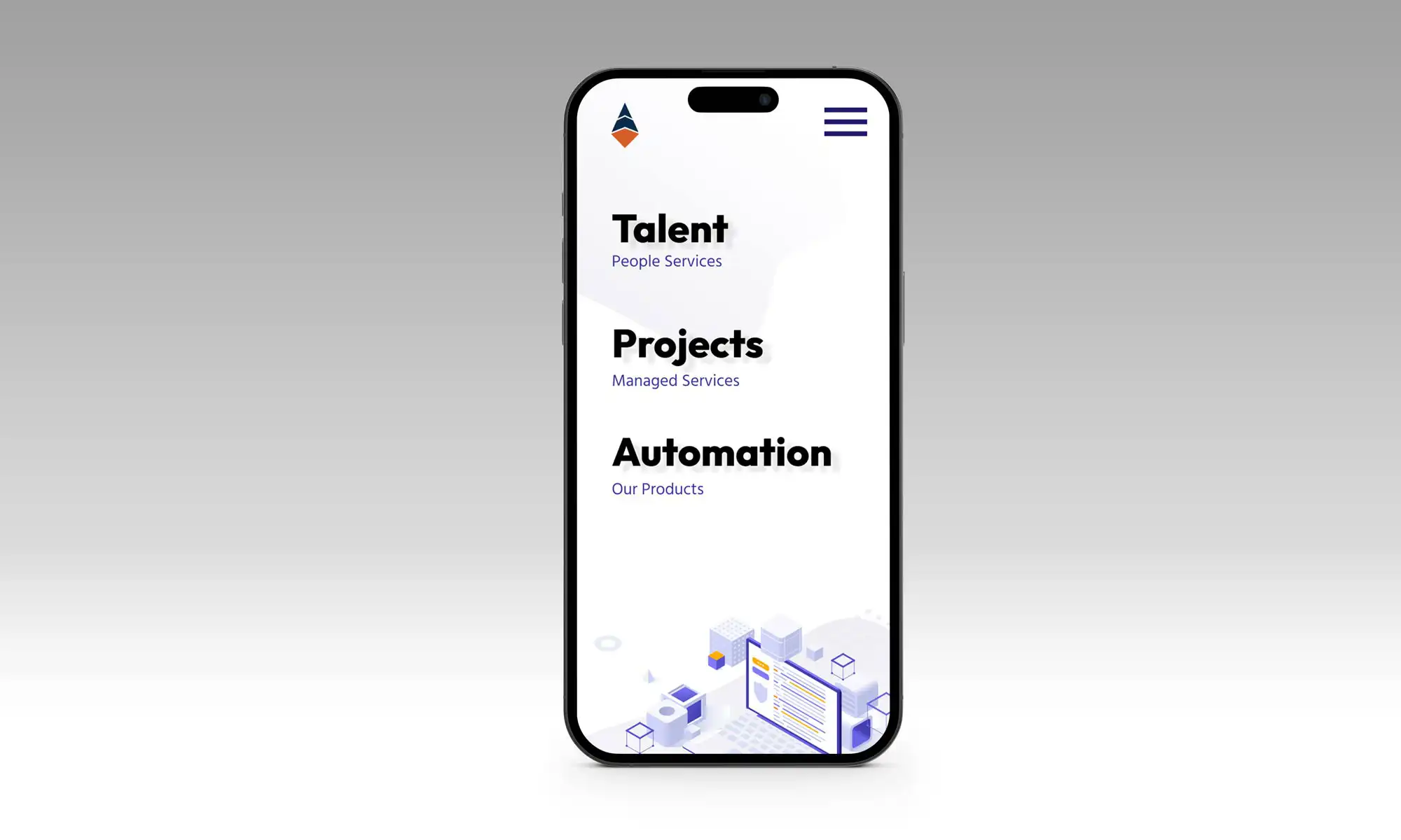
The final website was designed and developed to be fully responsive, SEO-optimised, and easy to manage. It included:
Custom service pages
Career opportunities section with tailored UX for job seekers
Dynamic content hubs for thought leadership
Scalable layout structure for future growth
I carried out full cross-browser and device testing, site speed optimisation, and accessibility checks. The launch marked not just a new website, but a digital relaunch of the brand itself.
Results
A strong, differentiated digital identity that speaks to both candidates and clients
Clearer communication of services, culture, and positioning
Increased engagement and time on site
A responsive, scalable platform built to support ongoing growth
Primary Colors
Innovative Coral (#D65E29)
Tech Navy (#092C4C)
Cloud Whisper (#F8F9FA)
Clear White (#FFFFFF)
Logo Design
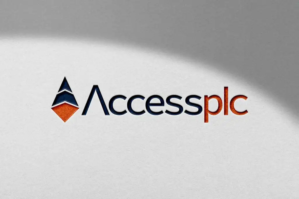
The diamond-shaped logo visually represents Accessplc’s dual focus:
The base coral triangle: human-first, approachable, energetic
The top navy elements: precise, reliable, and professional
Together they form a multi-faceted identity that signals connection, clarity, and confidence.
This project wasn’t just about a new coat of paint. It was a chance to realign the brand with its mission and bring clarity to a sector often cluttered with sameness. Accessplc now stands with a stronger voice, clearer message, and a platform that truly reflects who they are and what they do best: connecting people and potential in the tech world.



Good design begins with listening.
I work with teams to shape products and create experiences that feel clear, consistent and purposeful.