Logo Design,
Brand System,
Jubilee Variant
Style Guide
Client: 170‑year‑old public psychiatric hospital
Scope: Logo Design, Brand System, Jubilee Variant & Style Guide
Tools: Adobe Illustrator, Figma
This hospital is celebrated as the oldest still-operating psychiatric institution in Poland, serving its community for over 170 years. To mark this milestone, a broader campus revitalisation took place: building facades were refreshed, greenery restored, interiors modernised—just in time for a high-profile visit from national dignitaries.
Against this backdrop, the hospital launched a two-stage logo competition: an internal shortlist followed by a public social-media vote among three finalists. My design won thanks to strong community support and official backing, reinforcing the hospital’s trusted legacy.
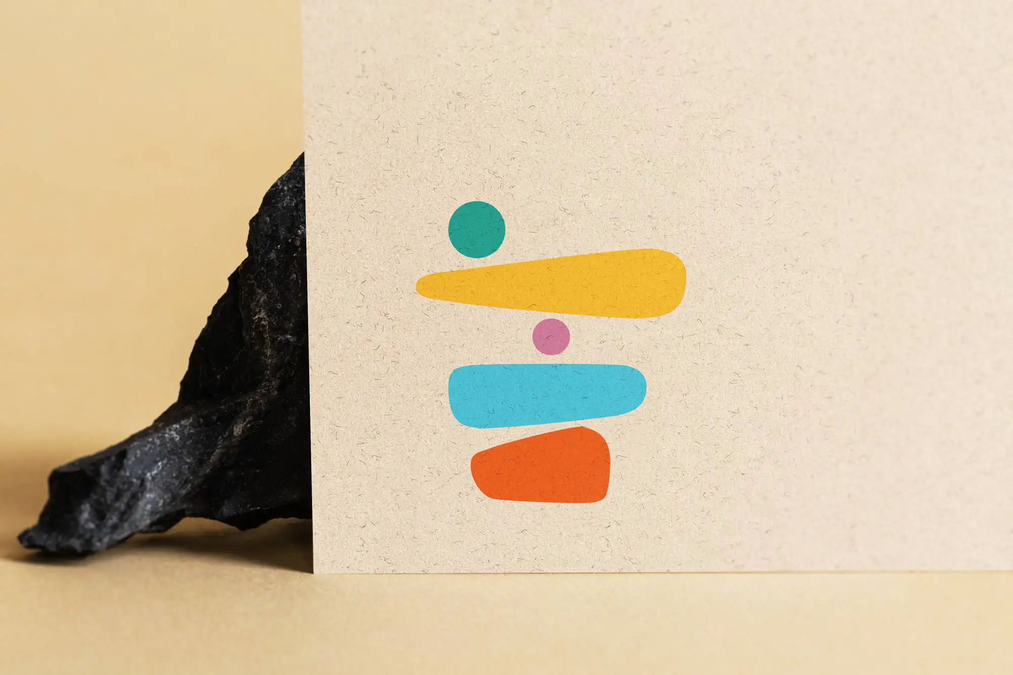
Primary logo system: standard, compact, monochrome, digital & print versions
Special jubilee logo in burgundy (“bordo jubileuszowe”) for the 170th anniversary
Brand identity manual (księga znaku) covering logo usage, typography, colors, exclusion zone, examples
Deliverables in all necessary formats: PDF, EPS, PNG, SVG
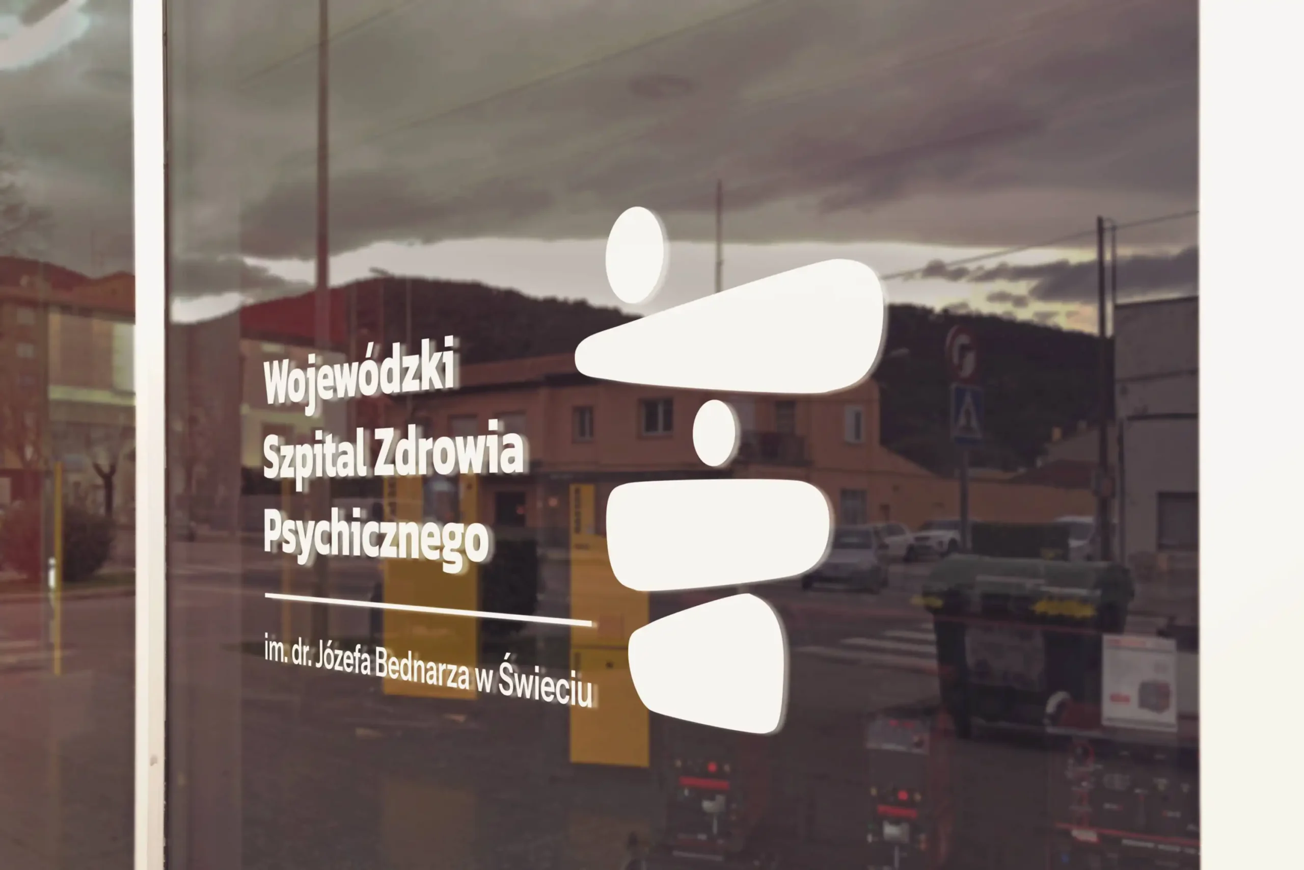
The new branding accents the hospital’s recent visual makeover: refreshed buildings, renewed landscaping, new or renovated facilities. The burgundy anniversary logo became a visual anchor that communicated care and tradition to patients, visitors, and media during official visits and celebrations.
The anniversary logo uses a deep burgundy colour to underscore prestige, history, and dignity. This variant was specifically designed for use throughout the yearlong celebrations—on banners, official communications, and commemorative materials—providing both visual consistency and respect for the occasion.
The project was completed with mutual satisfaction and implemented progressively into the bistro’s environment.
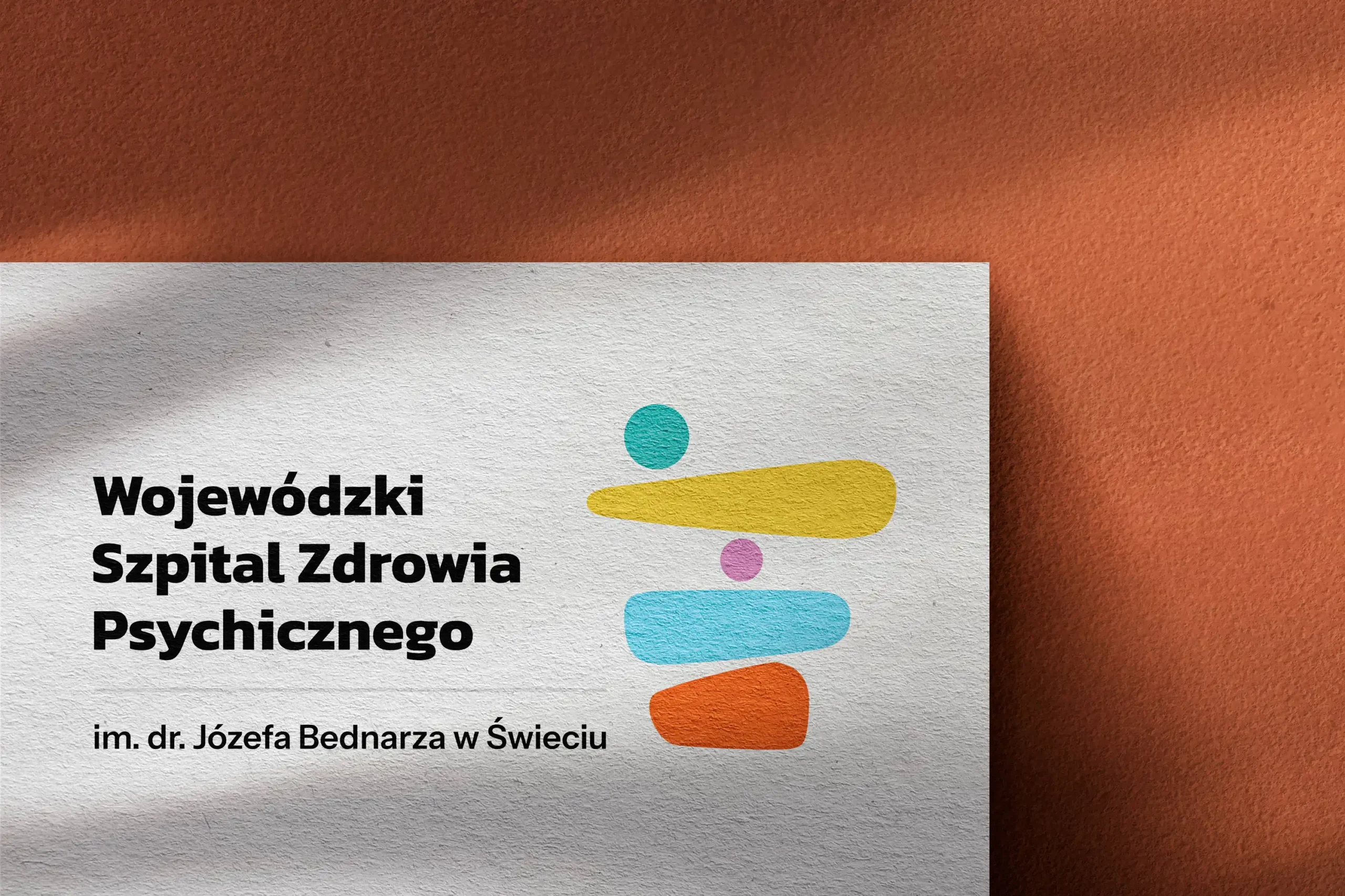
Colour palette: trusted blues & greens from hospital identity + special burgundy
Typography: clean, legible sans-serif reflecting clarity and modern functionality
Logo set creativity: built to ensure consistent application across print, web, signage
Jubilee variant fitted seamlessly into brand guidelines
Multi-version logo system (including 170‑year edition)
Comprehensive księga znaku covering usage on all media
Fully editable vector assets ready for any application
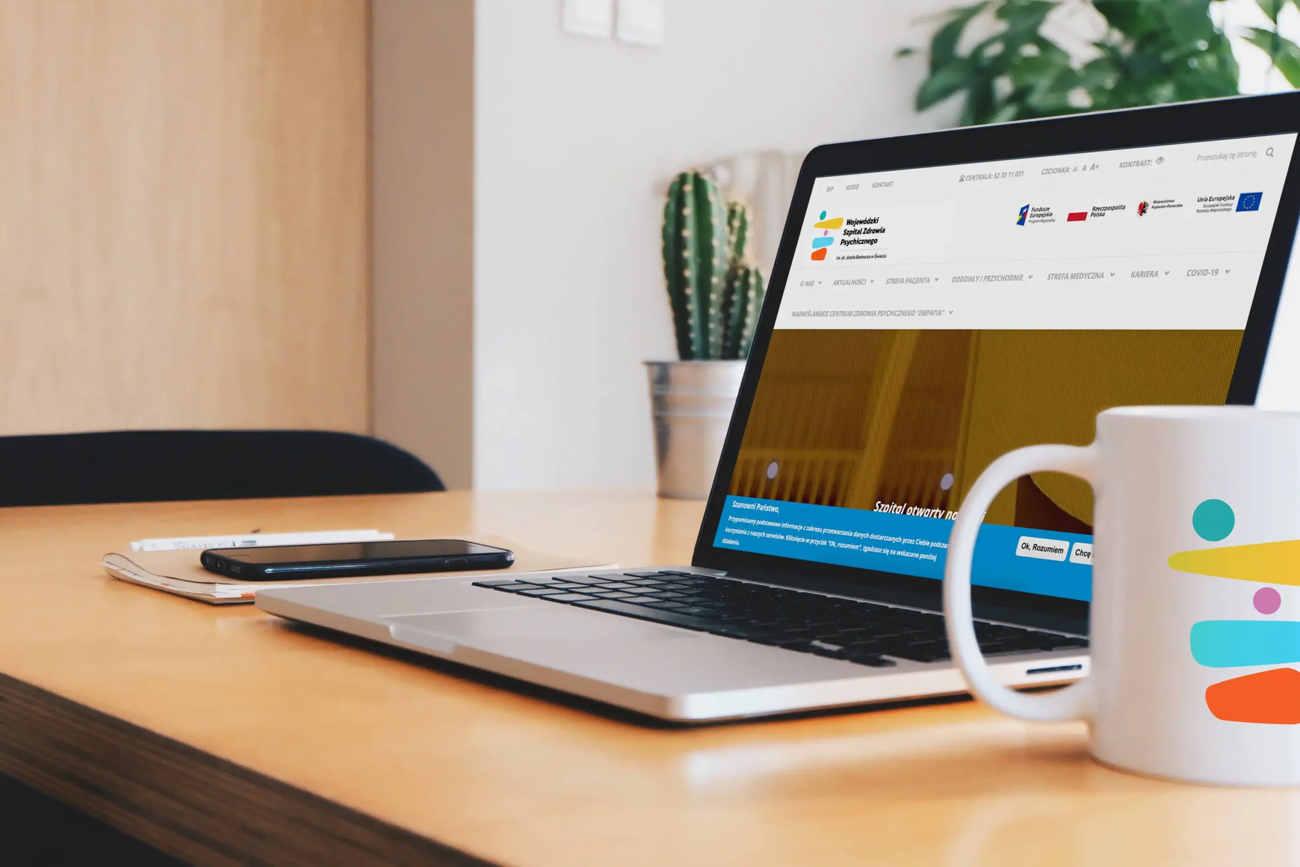
The logo launch coincided with the hospital’s anniversary events and the completion of facility upgrades—building trust and reinforcing the hospital’s image as a caring and enduring institution. The public vote added social proof, confirming positive community perception.
Figma → initial concepts
Illustrator → final logo execution
Księga znaku → brand manual production



Good design begins with listening.
I work with teams to shape products and create experiences that feel clear, consistent and purposeful.